02
MARKS
This brand guide describes how each element of Cuyahoga Valley Church’s visual identity—its logo, various lockups, color, typography, etc.—is designed to present a cohesive brand.
All of the elements outlined below are included for download and use in a variety of formats.
Logo
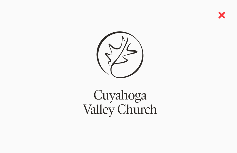
LOGO
The logo is the primary element of the Cuyahoga Valley Church brand identity. It can be applied on its own or in tandem with the logotype across brand materials.
A white logo may be used on backgrounds that will provide high contrast; e.g. relatively uniform color fields and non-busy photos or images.
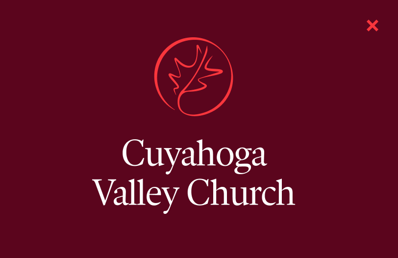
Alternate colorways of the logo within the brand color palette may be used in expressive settings at a designer’s discretion.
It’s okay to superimpose the logo on photos, but avoid doing so on images that won’t provide clear contrast.
Previous iterations of the CVC brand system have featured the leaf mark alone, omitting the circular border—please refrain from doing so moving forward. Always aim to show the leaf enclosed.
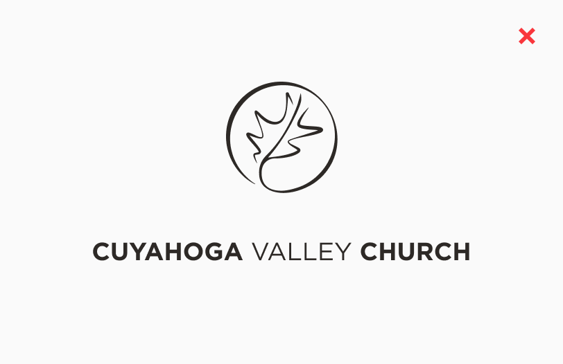
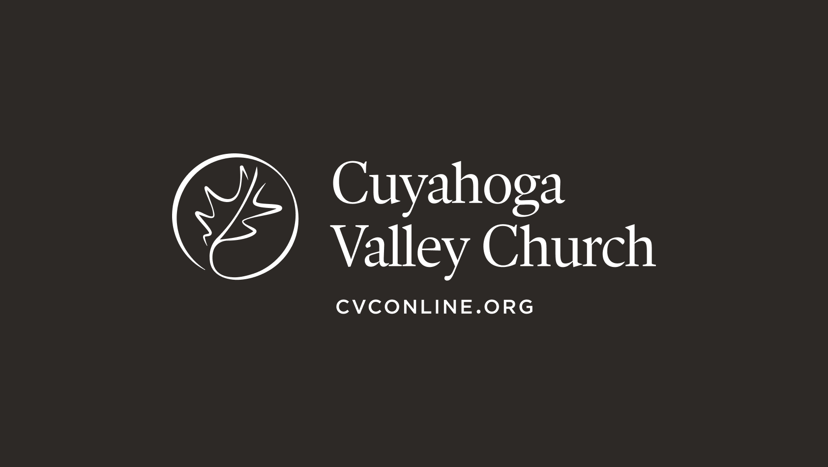
Horizontal Lockup
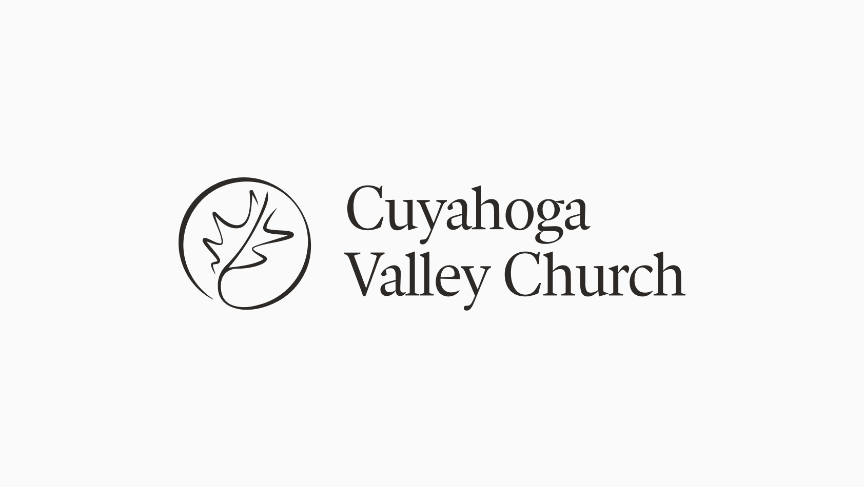
HORIZONTAL LOCKUP
This lockup of the logo and accompanying type is the main brand asset. Use this lockup whenever possible, especially when using only one piece of the brand identity—e.g. when it will appear in a third-party setting alongside other organizations’ logos.
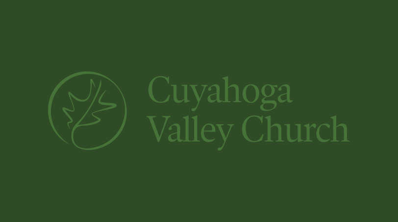
CVC’s functional brand colors are black and white, but alternate colorways of the lockup within the brand color palette may be used in expressive settings at a designer’s discretion.
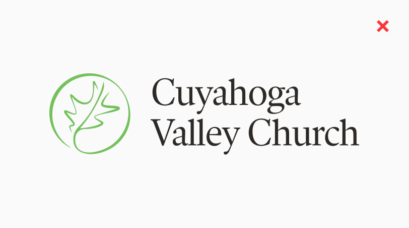
Two-color combinations of the logo and logotype should be avoided. Always apply the lockup in one color so that the logo and logotype match.
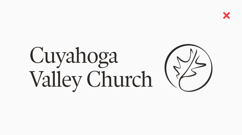
The horizontal lockup should always feature the logo on the left and the logotype on the right—don’t reorient these elements.
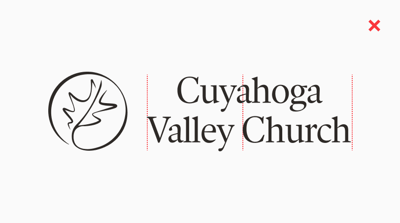
In the horizontal lockup, the logotype is left-aligned. Don’t use the center-aligned logotype from the stacked lockup in this horizontal orientation.
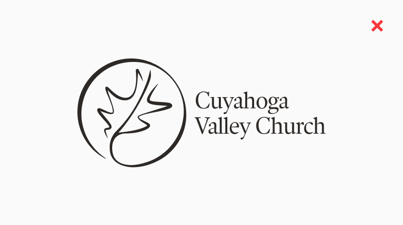
Don’t shrink or enlarge the relative proportions of the logo and logotype to create a new version of the lockup.
Don’t set type next to the logo to create a new version of the lockup. Always use the logotype as designed.
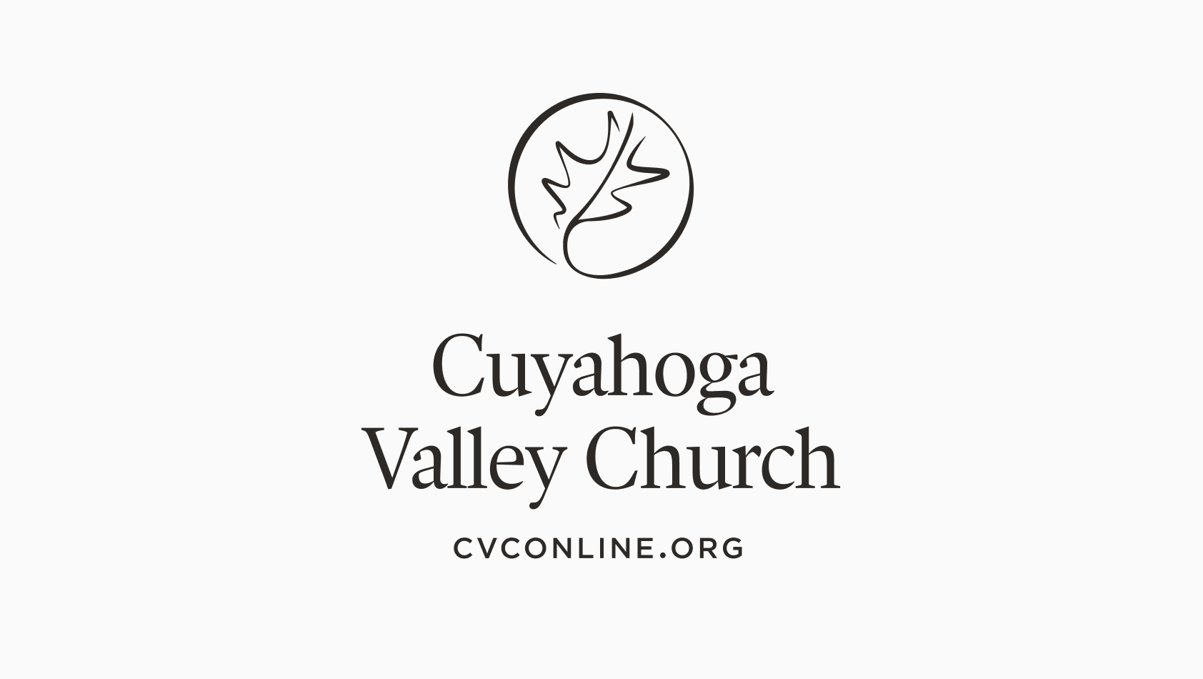
Stacked Lockup
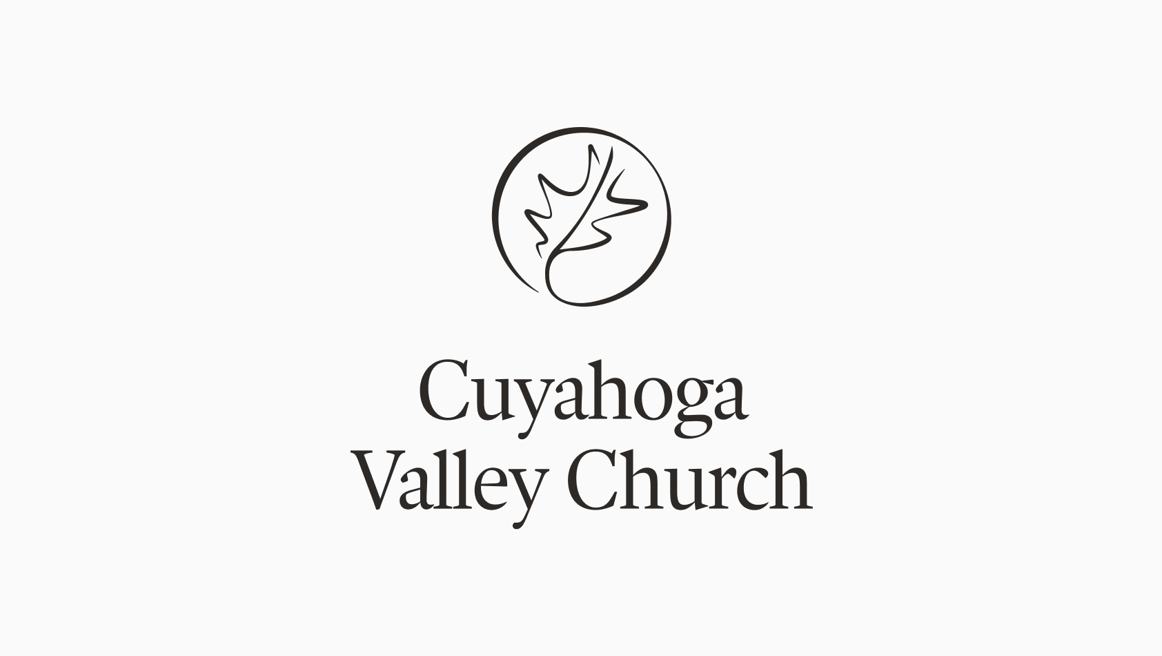
STACKED LOCKUP
This lockup of the logo and accompanying type is an additional brand asset. Use this lockup whenever appropriate, especially when using only one piece of the brand identity.
Always aim to apply the lockups on backgrounds that will provide contrast; e.g. relatively uniform color fields and non-busy images.
Two-color combinations of the logo and logotype should be avoided. Always apply the lockup in one color so that the logo and logotype match.
The stacked lockup should always feature the logo above the logotype. Don’t rearrange the logo and logotype to create a different lockup.
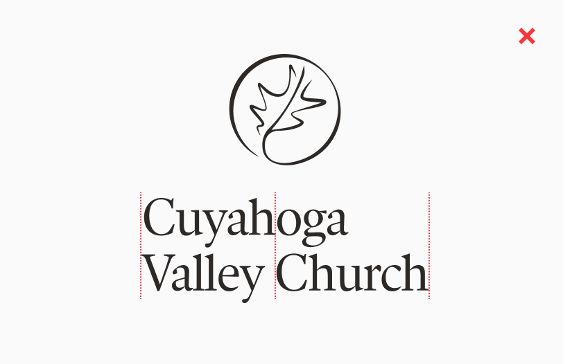
In the stacked lockup, the logotype is center-aligned. Don’t use the left-aligned logotype from the horizontal lockup in this stacked orientation.
Don’t shrink or enlarge the relative proportions of the logo and logotype to create a new version of the lockup.
Don’t set type next to the logo to create a new version of the lockup. Always use the logotype as designed.
Campus Lockups
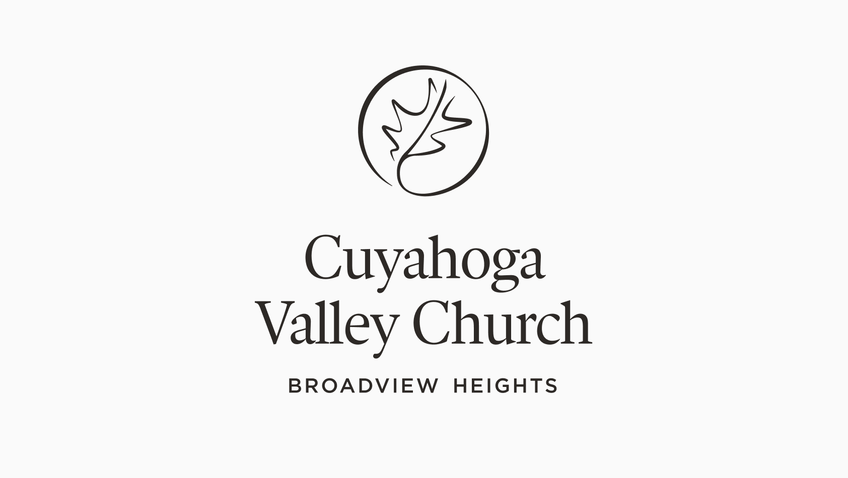
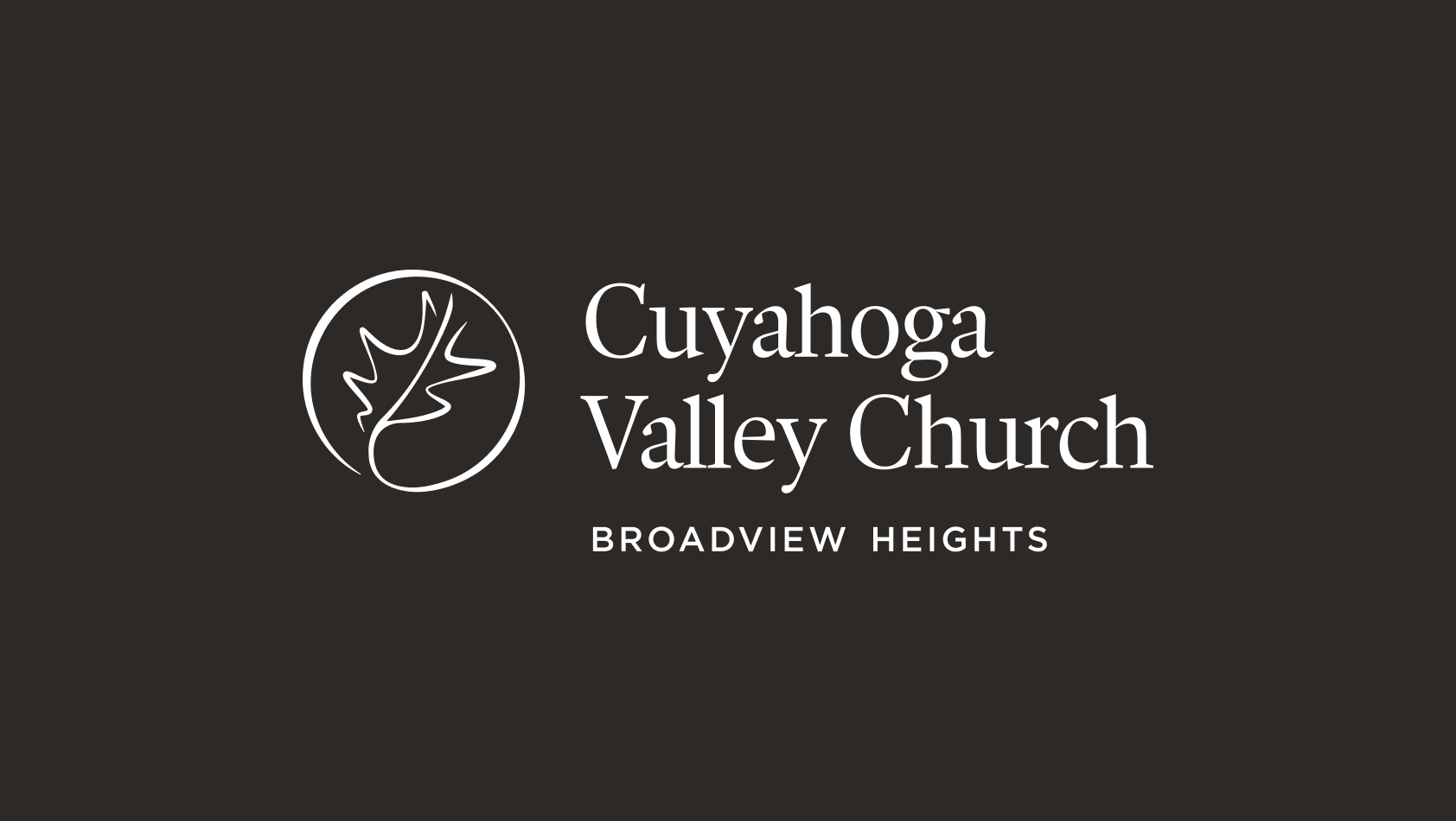
BROADVIEW HEIGHTS
This supplementary version of the lockup should be used in applications where distinction between CVC’s different campuses would be advantageous or beneficial.


BRUNSWICK CAMPUS
This supplementary version of the lockup should be used in applications where distinction between CVC’s different campuses would be advantageous or beneficial.
CVCONLINE.ORG
This is an additional version of the main lockup that can be used in appropriate settings at the designer’s discretion.